
21 January . 2025
2025: The Year of Mocha Mousse
It is official!
2025 is the year of earth tones. If you have watched interior design trends over the last few years, there has been an interesting transition from whites to greys to vibrant colors. Last year we saw an obsession with jewel tones such as deep greens, sapphire blue and rich shades of burgundy. This year, trends predict a slow transition from the deep warm tones to something a little more neutral.
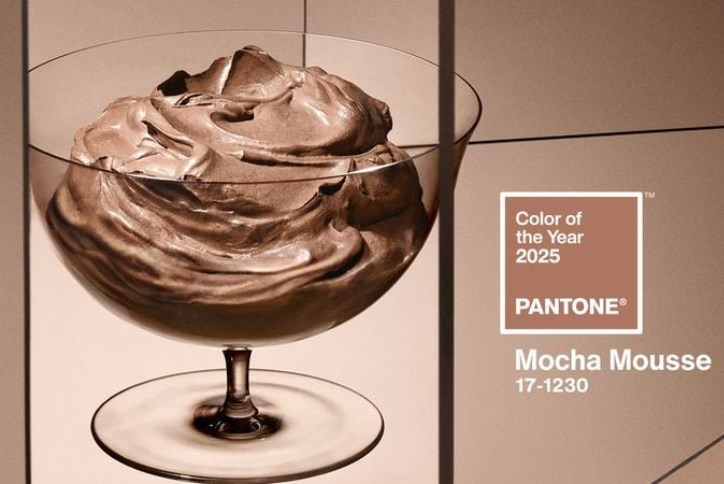
Every year the trend watchers at the Pantone Color Institute select their choice for color of the year. Considering everything from fashion to politics to socio-economic conditions when determining the color, Pantone’s goal is to draw attention to the relationship between culture and color.
Late last year, Pantone selected their color of the year for 2025, and we are in love. Pantone’s Mocha Mousse has all the warm richness we’ve seen in the jewel tone trends of last year while still bringing us back to a neutral elegance. This color will have you feeling serene and grounded, and who doesn’t need that every now and then.
Mocha Mousse for Every Style
This color has range! It can be easily incorporated into nearly any interior design style as a trendy and elegant addition.
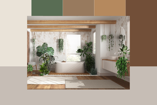
Earth Tones: This is probably the easiest color palette to incorporate Mocha Mousse into. Whether it is a throw pillow, a blanket, or fixing up a wall with a fresh coat of paint, this color will fit the organic hues of your home.
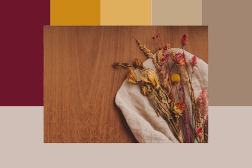
Autumnal Warmth: Fill your home with all the warmth of the fall. Combine Mocha Mousse with the deep burgundy colors we have seen in trends past as well as oranges and subtle yellows to feel a cool fall breeze whisper through the room.
Clean and simple: Combine this warm brown with creamy off-white colors, such as Alabaster, to create a clean and timeless feel.

Ocean Serenity: Combining the color of the year with dusty blue tones and softer beiges will allow you to channel the peace and serenity of the ocean without taking your space to full on nautical.

Color can shape an environment, and this color is the perfect example of that. Why not bring a little natural, grounded peace into your space? We are so excited to see how you incorporate it into your home!
Looking for a home to design in your unique style? Wendell Falls has you covered! Come make your interior design dreams a reality in one of the beautiful homes in our community.